Printed splashbacks are a practical surface that can also become the main design feature in a kitchen. They protect the wall from splashes and heat while giving you almost unlimited style options.
The key is choosing a pattern that suits your cabinets, worktops, and lighting. Marble, concrete, and botanical designs are three of the most popular directions because they can feel modern yet timeless.
Marble looks that feel premium without being busy
When choosing printed splashbacks, marble effects are popular because they bring a luxury feel into everyday kitchens. They can work with both modern flat front cabinets and more classic shaker styles.
Soft white marble with light grey veining is a safe choice for long term style. It pairs well with chrome, brushed steel, and even warm brass details.
If you want more drama, darker marble effects can look striking behind a hob. Deep veining and high contrast patterns often work best when the rest of the kitchen stays simple.
Try to match the veining tone to the worktop undertone. A cool grey marble pattern can clash beside warm wood or golden stone unless the palette is balanced.
Keep scale in mind as well. Large, flowing veining usually looks more realistic on bigger panels, while tiny veins can look repetitive when stretched across long walls.
Concrete and industrial patterns for modern kitchens
Concrete style designs suit minimalist and industrial interiors. They look clean, modern, and they pair well with black fixtures, wood textures, and simple cabinet colours.
Light concrete tones can add texture without darkening the room. This works well in smaller kitchens where you want interest but still want brightness.
Mid grey and charcoal concrete looks can create a stronger statement. They often suit open plan spaces where the kitchen needs a defined, confident look.
Concrete patterns also tend to hide small marks better than very pale designs. That makes them a practical choice for busy households that cook often.
To keep it cohesive, repeat the industrial tone in small details. Black handles, dark taps, or metal shelving can help the concrete pattern feel intentional.
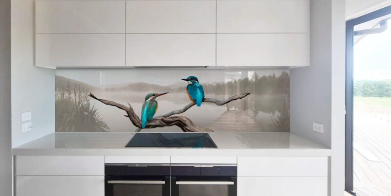
Botanicals, greens, and softer natural themes

Botanical printed splashbacks are popular because they add life and warmth to a kitchen. Leaf prints, soft florals, and tropical designs can work as a focal point without changing cabinetry.
For a modern look, choose botanicals with plenty of negative space. A simple leaf outline on a pale background can feel fresh rather than overly decorative.
Deeper green botanical patterns can look rich and cosy. They work especially well with wood cabinets, stone effect worktops, and warm lighting.
Scale and placement matter with botanicals. A large leaf design can look stunning on one main cooking wall, while smaller repeating prints may suit a shorter run behind a sink.
If you want the pattern to feel calm, pick muted tones rather than bright saturated greens. Softer colours tend to stay appealing as trends change.
Conclusion
Printed splashbacks give you the freedom to introduce marble luxury, concrete texture, or botanical warmth in a single practical surface. The best choice is the one that matches your fixed elements such as worktops, floors, and appliances.
By considering pattern scale, undertones, and how lighting will affect the design, you can choose a print that feels modern and cohesive for years. A well chosen pattern turns a functional splashback into a defining feature of the kitchen.